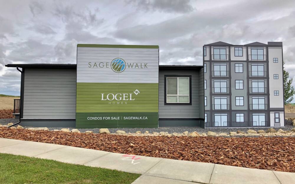
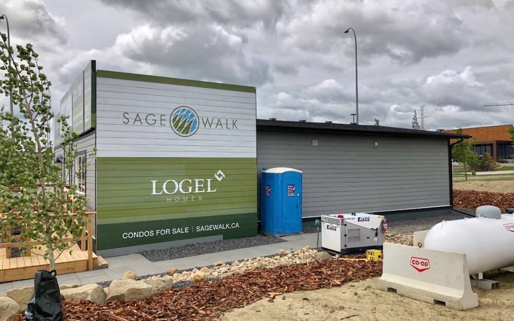
It all starts with a good plan
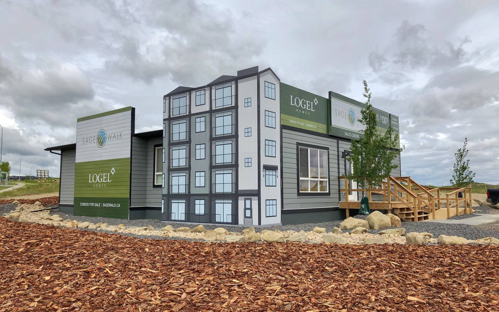
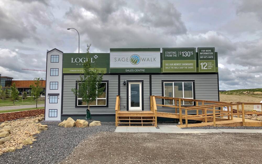
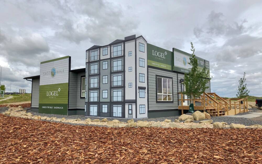
This is a great example of how to make a sales centre not look like a site trailer.
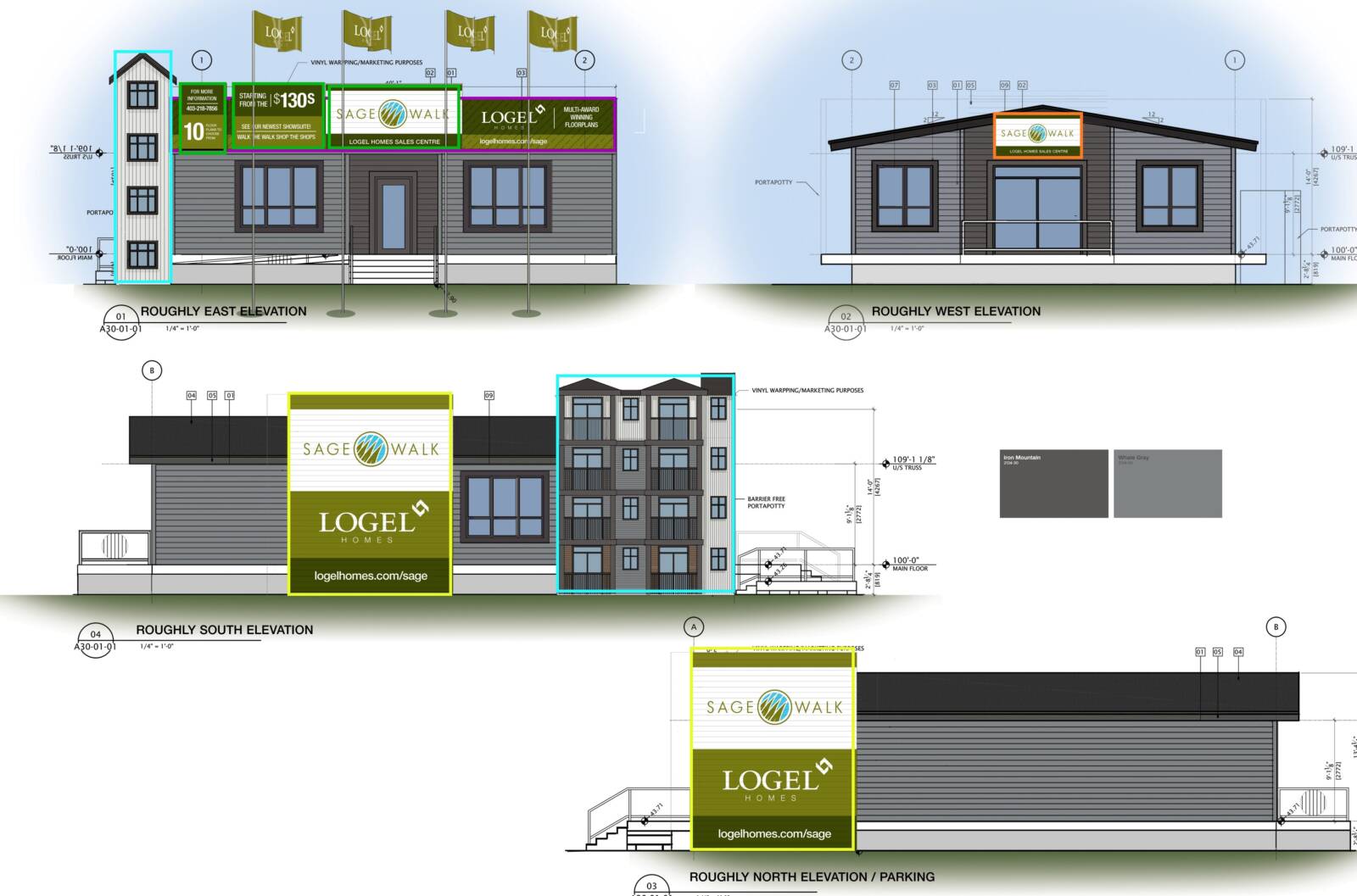
Be sure to consult with us during the design phase of your sales centre. We'll provide recommendations on materials, size, and shapes which can make your signs more effective and save time & money.
Having a good plan on paper helps our Installation Team know exactly what the final outcome should be.
It's always great to see the rendering come to life!
The signs above the entry are simple rectangles float mounted to provide some dimensionality. With our router table equipment, it's easy to cut shapes giving more impact to your marketing.
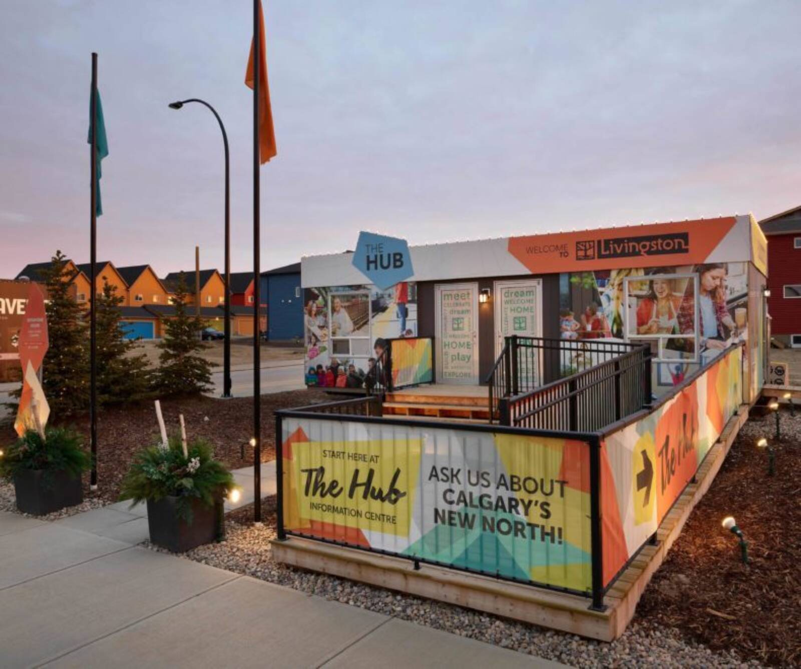
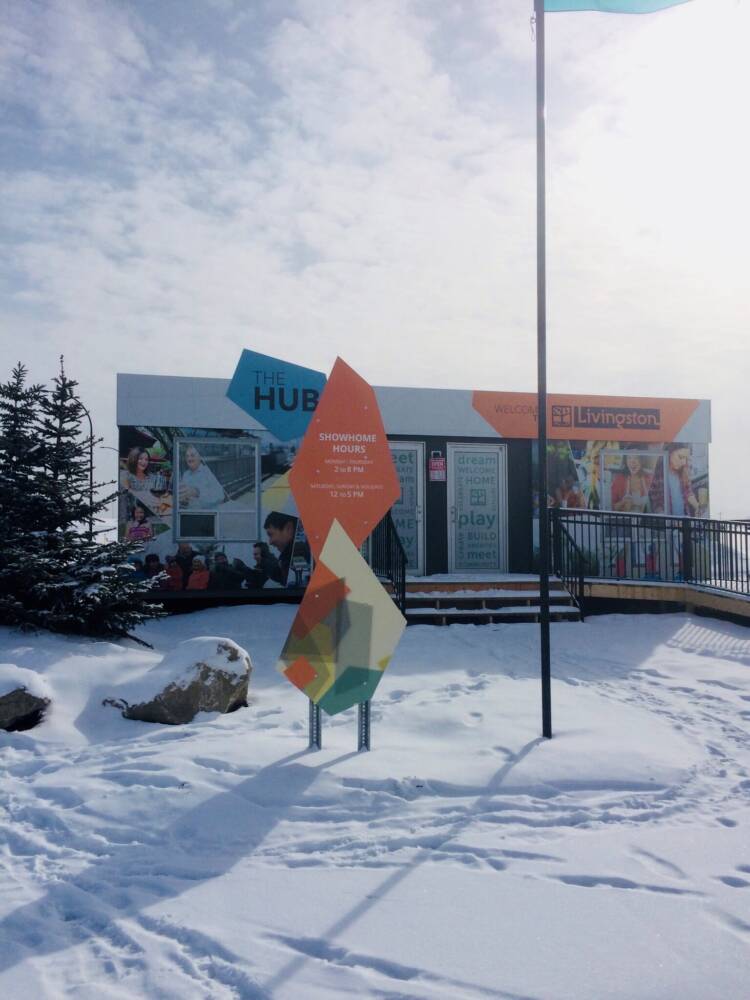
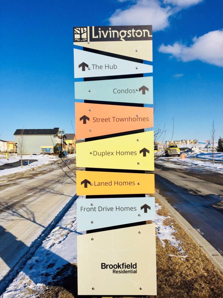
Just like size, Shape and Colour matter
This project has a really well-designed sign system in terms of both impact and functionality. You'll have no problem finding this information centre with all the shapes and bright colours (even though it's not that big)!
The interesting shapes and bright colours draw your eye as you drive down the boulevard.
The modular nature of the sign system allows for cost effective and quick changes when something moves to a different location during the life of the project.
Metal sign posts for the lot signs make for cost effective, quick, and simple installation & relocation.
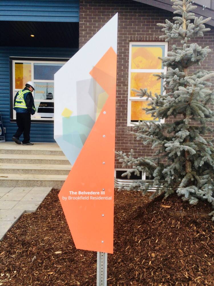
The sign of a good sign
On one side, they have to look pretty with an effective message. On the other side, they have to be well constructed.
Trust us, printing signs is the easy part! Our Build and Install team have the tough job. They'll do site visits to measure, do the locates and work through all sorts of nasty weather, much like home builders!
They say there's more than one way to skin a cat. We're not certain exactly what that means; dogs are preferred. We can say, however, there's more than one way to build a sign.
While there are many methods, what's most important is that the sign is structurally sound, safely installed, aesthetically pleasing, and built to withstand the harsh Canadian elements.
Now, here's a couple of ways to skin a sign:
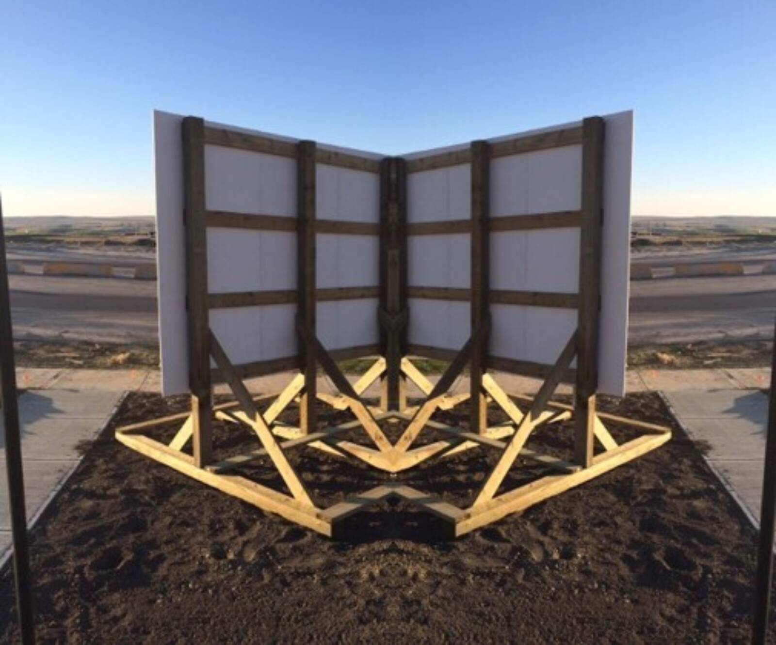
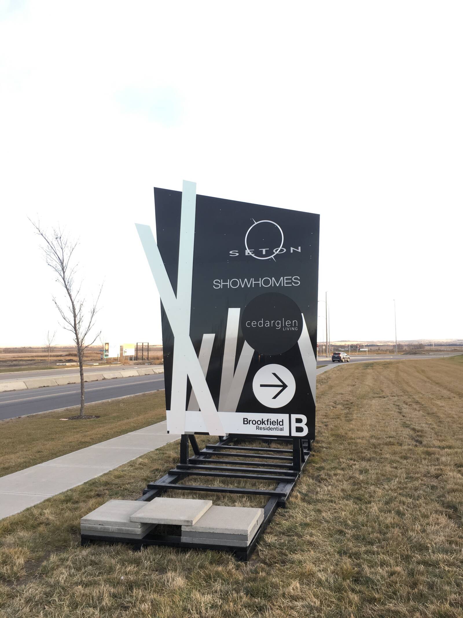
ABOVE: Looks like an athlete crouched in the ready position. Go ahead, try and push me over. A thing of beauty.
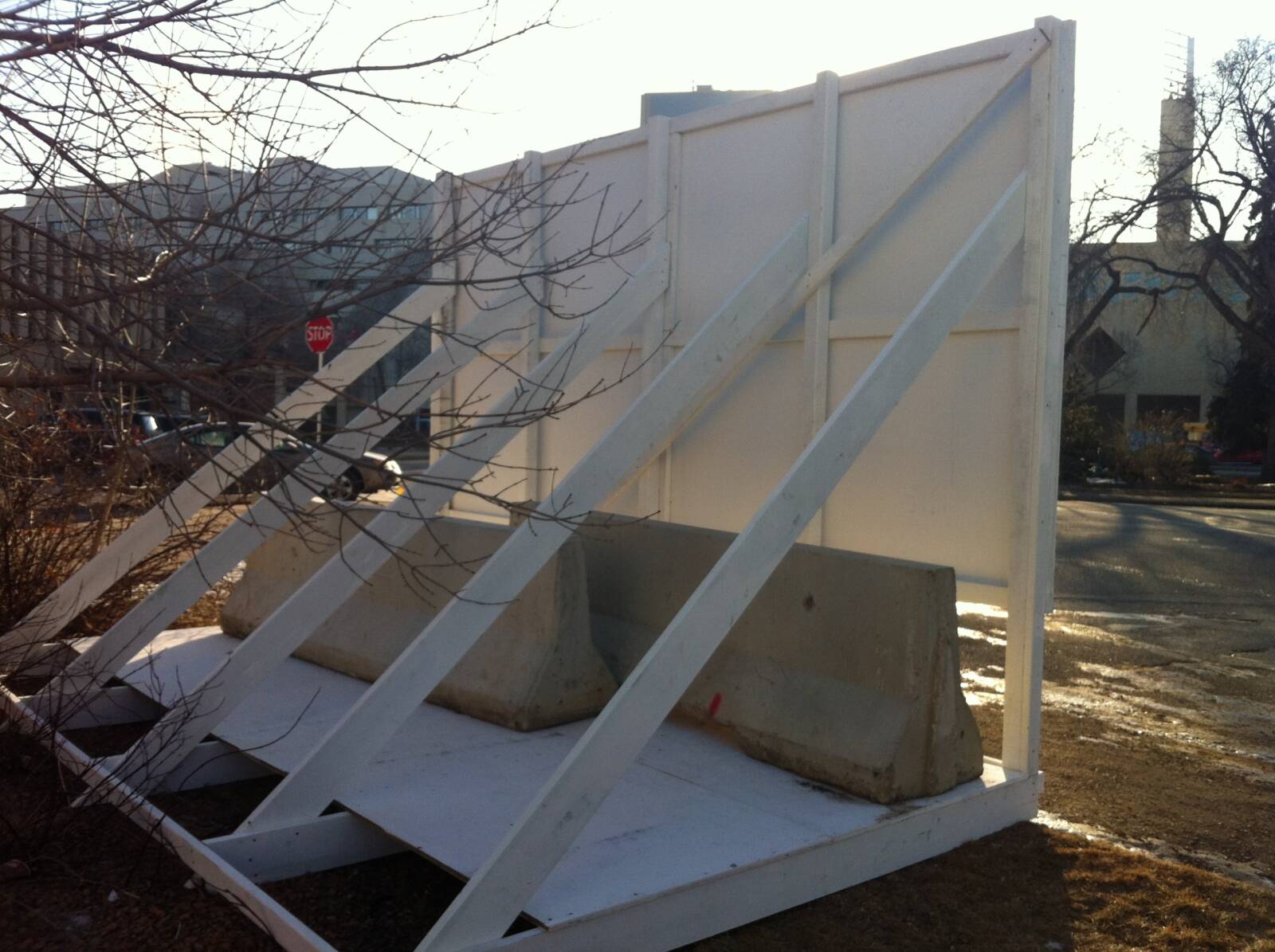
BELOW: Less beautiful but highly effective.
Go big or (they will) go home
When you need to draw them in from the highway, size is obviously a good strategy. Adding shape, colour and an effective message adds the polish needed to finish the job to make sure they turn at the right spot! Right turn, Clyde.
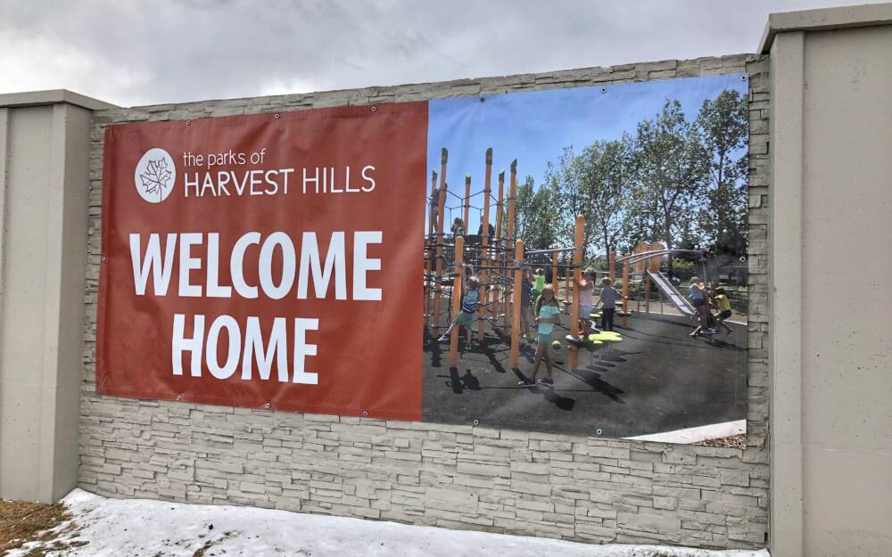
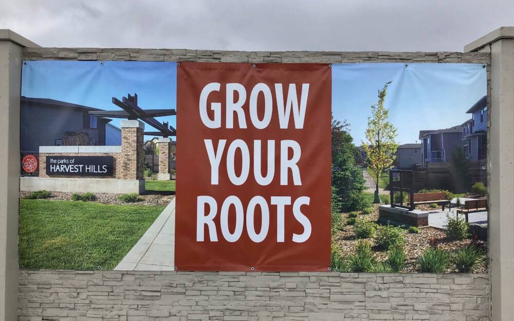
BELOW: Good, cost-effective use of existing community walls to create large signage using outdoor vinyl banner material. Banners are heavy-duty hemmed and grommeted for outdoor use and securely fastened to ensure they don't end up flapping in the wind.
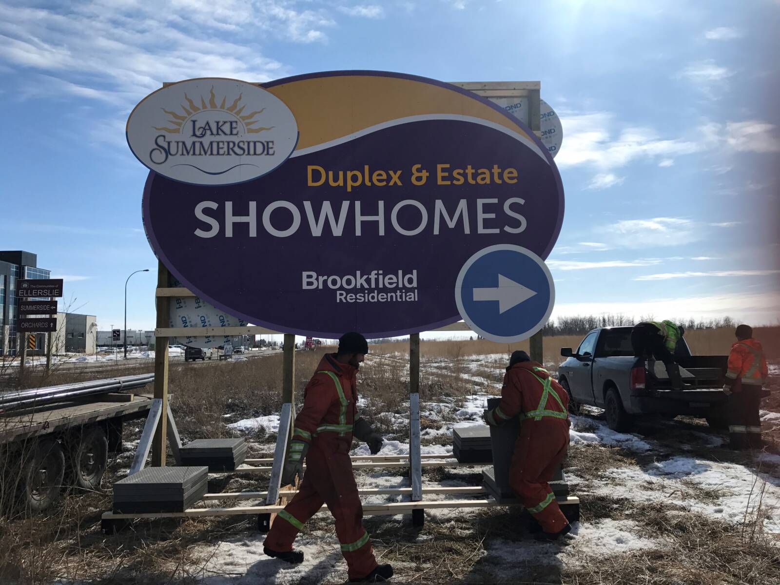
BELOW: Oval shaped and bright colours for maximum impact. The installation crew builds a solid frame structure and ensures it's not going anywhere.
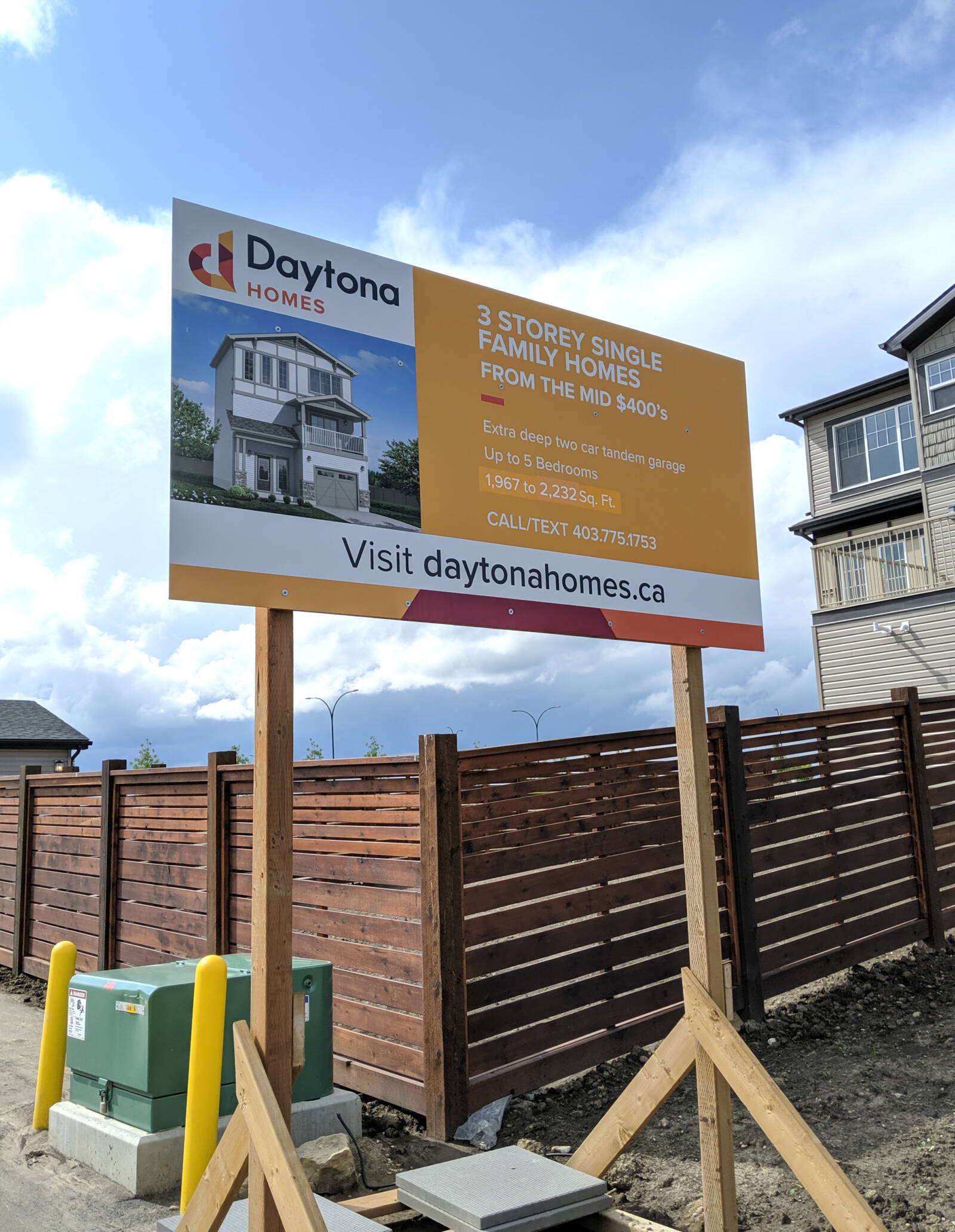
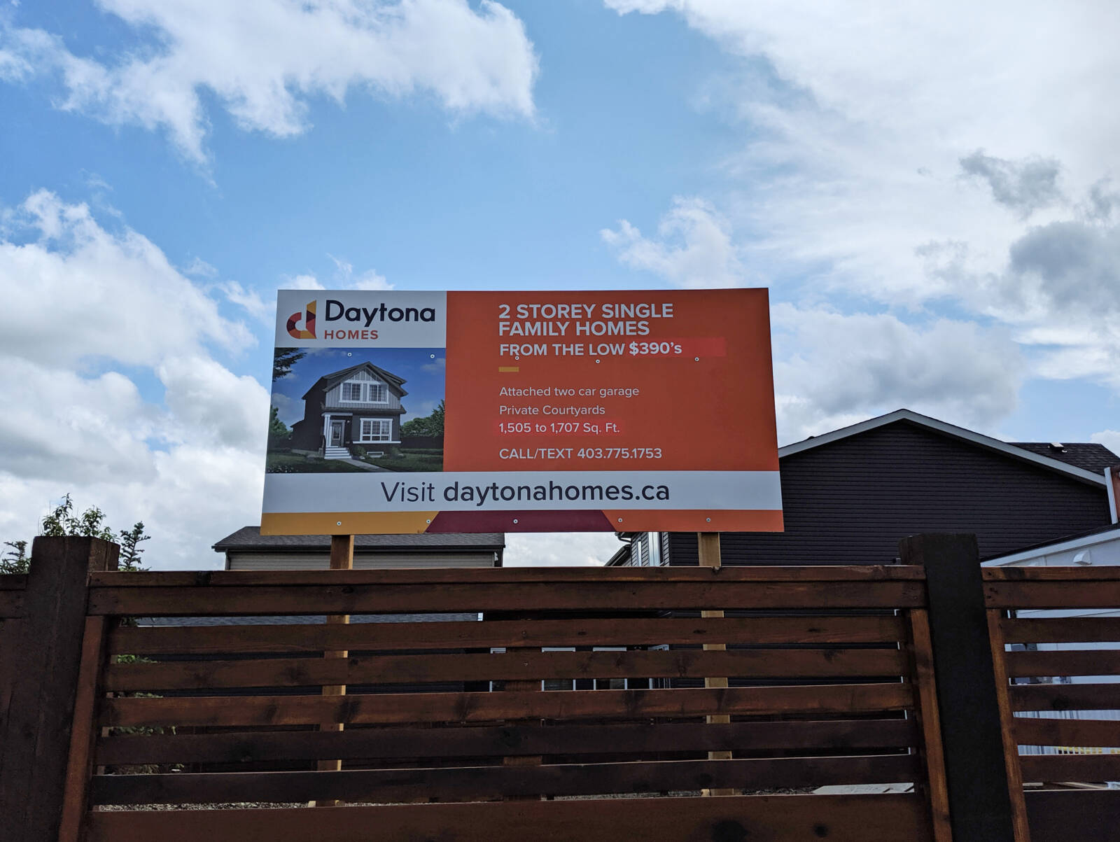
Pretty straightforward but effective signs. Great use of colour to differentiate 2 storey from 3 storey. Built on stilts so you can see them over the fence!
You can lead a home buyer to water (or your sales centre)
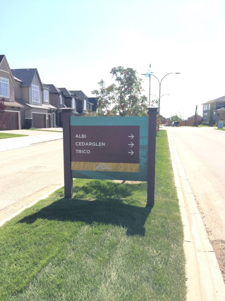
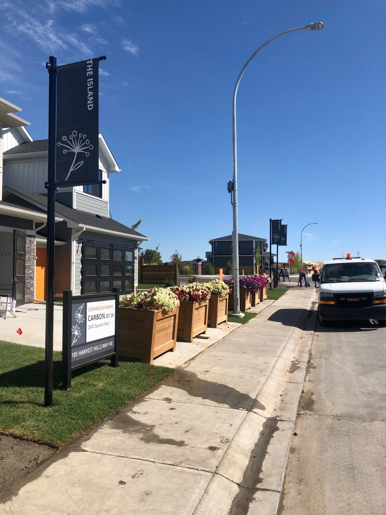
Effectively branded directional signage on the boulevards will lead your home buyers where you want them - to the sales centre!
Having a cohesive design for all signage and pole banners make it easy to follow the bread crumbs.
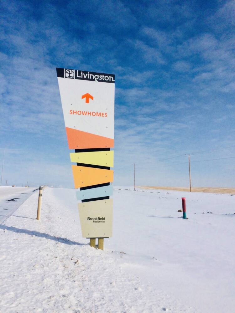
ABOVE: Again, the unique shape makes the sign more visually interesting. Solid construction and installation with sidewalk blocks to ensure that baby won't blow over.
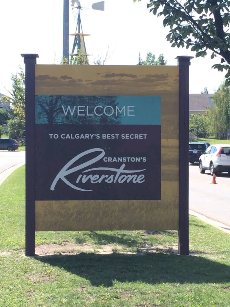
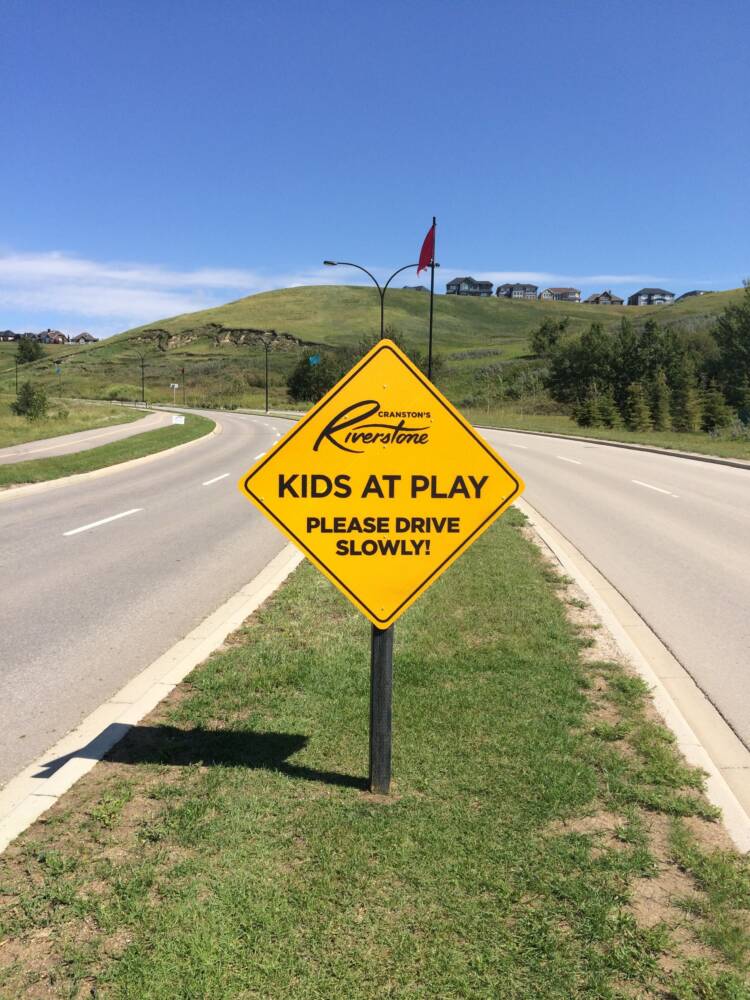
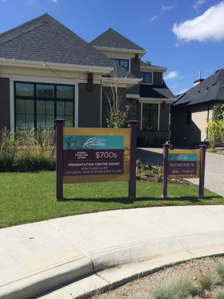
Nice, consistent design theme for the whole series of Welcome, Directional, and Lot signs. Added safety signage is helpful as families start to move into the area. Painted posts with decorative caps add a nice touch and tie into the overall brand.
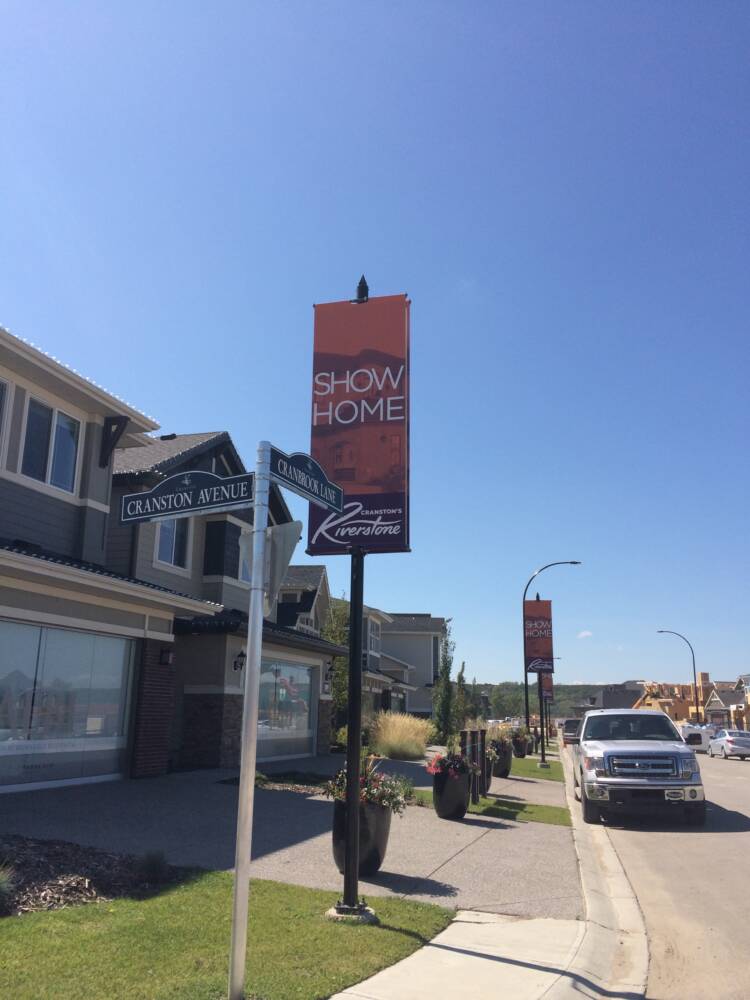
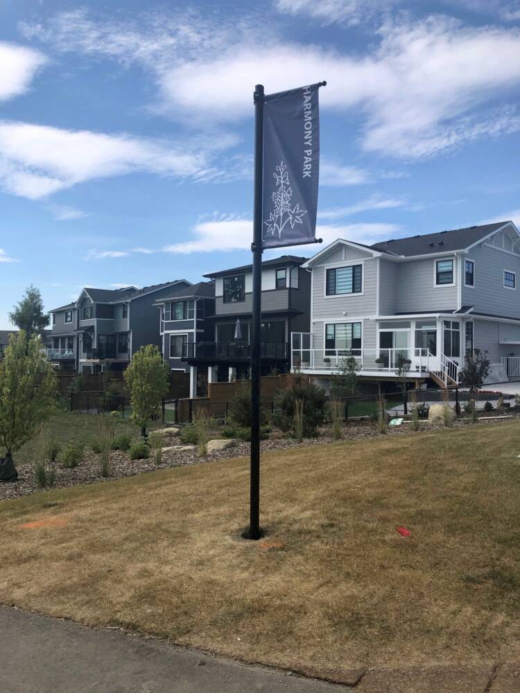
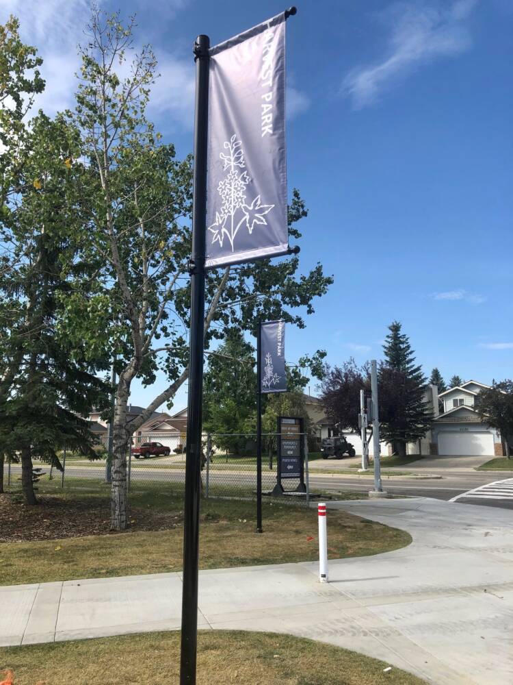
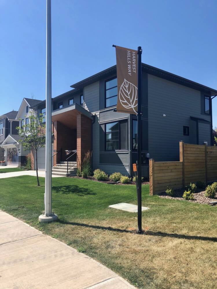
Don't make them work to find you
Pole banners and flags are an effective way to let customers know they are getting close or have arrived at show homes and sales centres.
Note the name of that show home model - naturally our favourite!